The Style Sheet
BRAND GUIDE
How Agent Hero looks, sounds, and holds a page. A comic-book identity for a serious tool — bold ink, hard shadows, aged paper, and a voice that says the thing plainly.
01 · The Brand
What Agent Hero Is
The identity comes from that promise: a hero for the working agent. Not a mascot gimmick — a confident, comic-book world (issues, powers, villains, recruitment) that frames a genuinely capable general agent. The look is vintage superhero print: aged newsprint, saturated cape colors held back a notch, thick ink outlines, and hard offset shadows. The tone is bold but honest — we make big claims and then show the receipts.
02 · Logo & Emblem
The Mark
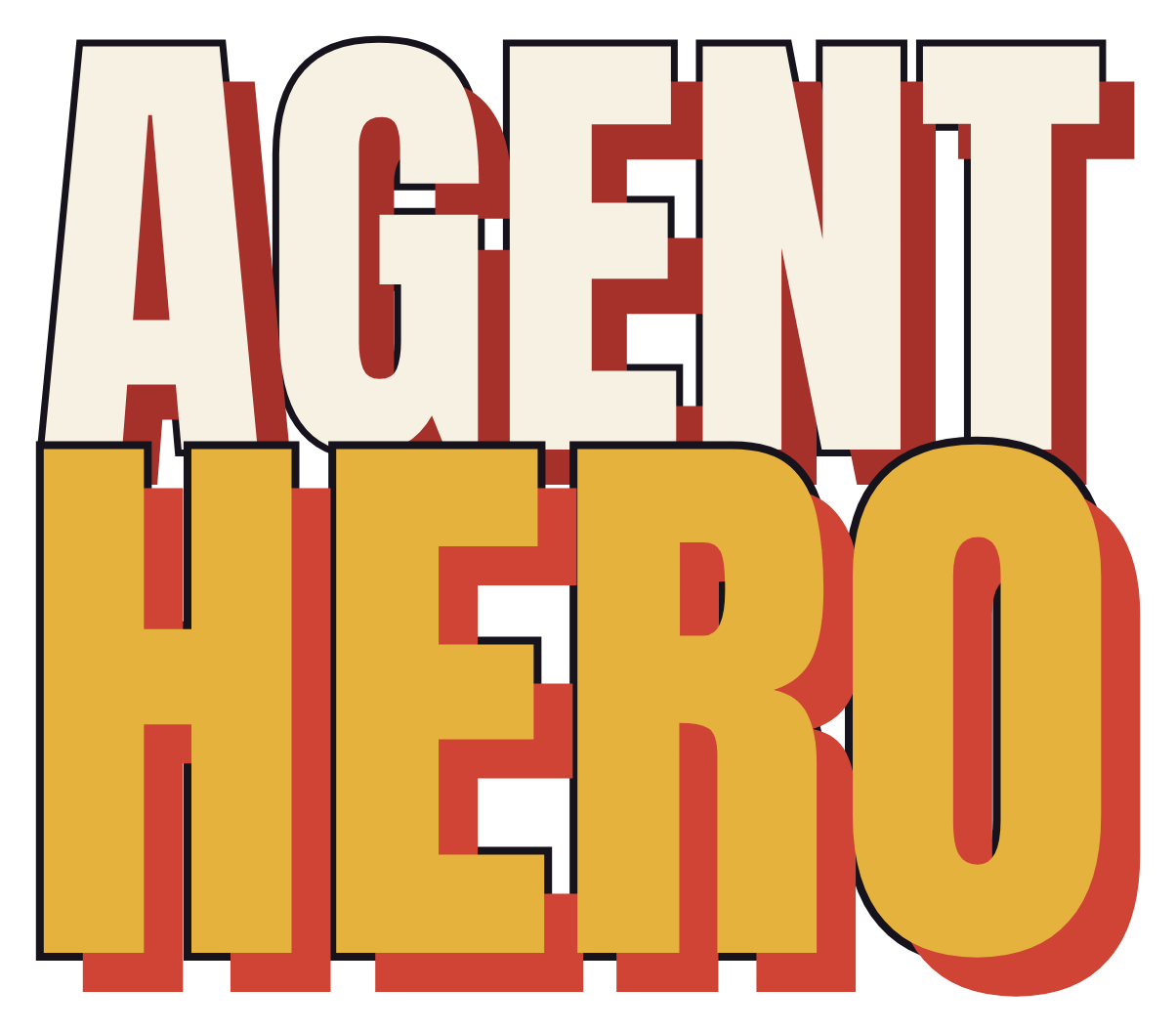
The wordmark stacks AGENT (cream) over HERO (gold) in Anton, each with an ink stroke and a hard red offset shadow. The emblem is a diamond shield (cape red) holding a house (gold) — real estate, defended.
↓ Download wordmark — PNG, transparent
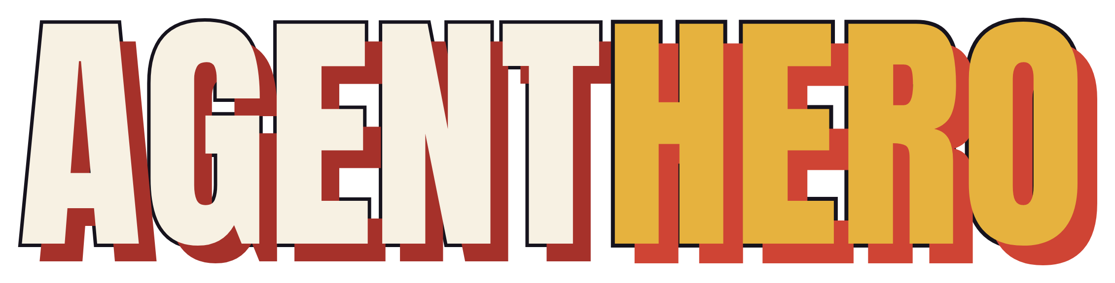
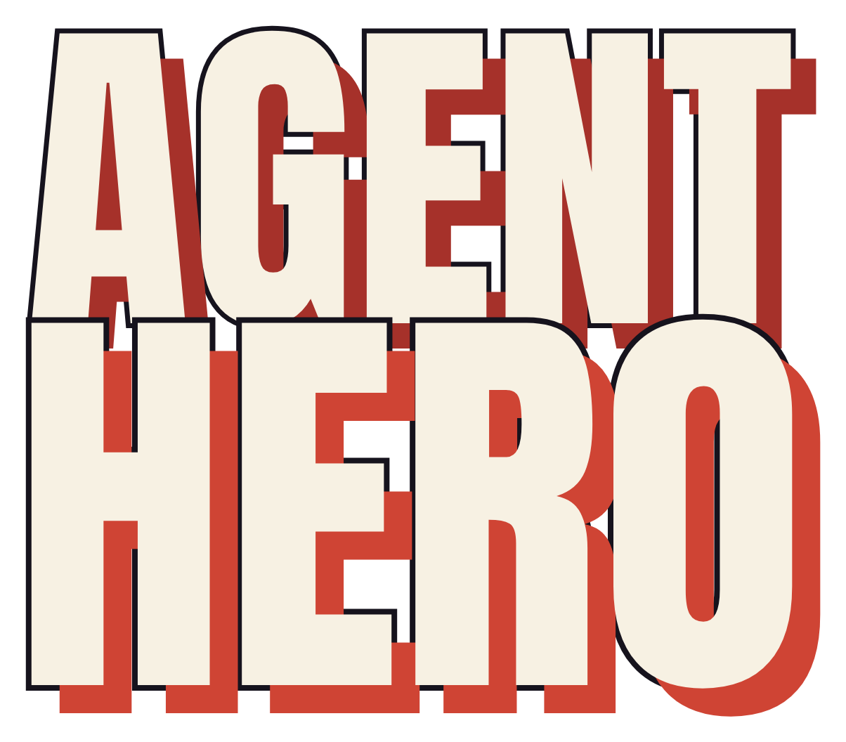
Other versions: Horizontal · White (for dark backgrounds) · Emblem lockup
03 · Color
Palette
A desaturated comic palette: aged paper and deep night as the stage, cape red and gold as the heroes, ink as the line that holds it all together. Every value below is exactly what ships in the CSS.
Foundation
The Heroes (accents)
The Night (support)
04 · Typography
Type System
Three faces, three jobs. Anton shouts, Bangers plays, Inter explains. Never swap their roles. All three are free, open-source Google Fonts — grab them at the links below and match the exact weights.
Every claim gets a plain-spoken sentence and, where it matters, the receipts. Inter carries the argument: readable, confident, and never dressed up. Body runs 400–500; bold is 700–900 for emphasis and labels.
The site loads all three from Google Fonts in one request: family=Anton&family=Bangers&family=Inter:wght@400..900.
05 · Visual Language
The Comic Devices
The details that make it a comic, not a template. Use them with intent — a little goes a long way.
Ink Outlines
3–5px ink borders on cards, panels, and buttons. Everything is drawn, not floated.
Hard Offset Shadows
Solid ink shadows (no blur), 5–8px down-right. On hover, the element lifts toward the cursor.
Halftone & Speed Lines
Faint dot fields and radial speed lines add vintage-print texture behind key sections.
The VS Burst
A red starburst reading "VS" — the showdown motif that runs through comparisons.
Caption & Verdict Boxes
Gold caption boxes with a red tab deliver the "quick verdict" — comic narration for the reader.
Kickers & Issue Tags
Small red/gold kickers and "ISSUE #01" trade dress frame each section like a comic page.
06 · Voice & Tone
How We Talk
Bold and plain-spoken, with a comic-hero wink — but clarity always wins over cleverness. We make big claims and then back them, and we're honest about what we don't do.
Do
- Say the thing plainly: "Answers every lead in seconds, 24/7."
- Lead with the benefit, then the proof.
- Use the hero world — powers, recruit, villains — with restraint.
- Concede real trade-offs. Honesty is the flex.
- Be confident: short sentences, active verbs.
Don't
- Reach for buzzwords: "synergistic AI-powered paradigms."
- Overclaim or bury caveats.
- Let the jokes crowd out the point.
- Hedge with filler ("we strive to help you try to…").
- Whisper. If it's worth saying, say it in Anton.
07 · Assets
Downloads
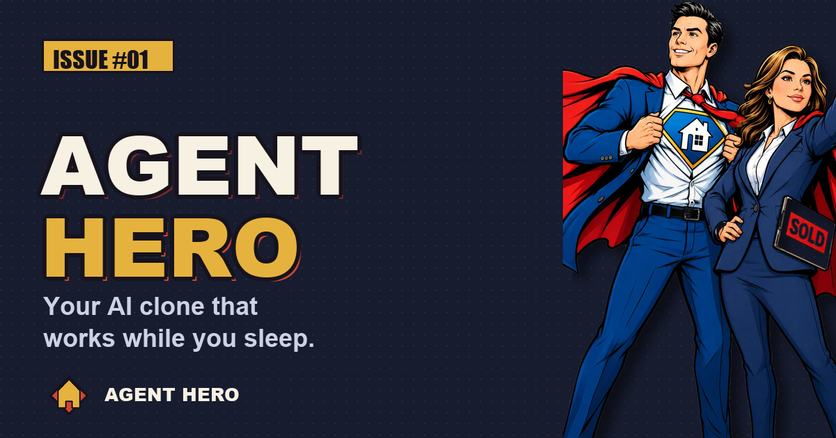
The live logo files and social card. The emblem is an SVG, so it scales cleanly to any size.